

Pivot tables allow you to succinctly summarize data in a spreadsheet. They are a core feature of most spreadsheet applications, including Google Sheets and Excel. With pivot tables, you can drill down into a dataset and group findings in a matter of seconds. You can quickly iterate and slice through data in unique ways. In this lesson, I’ll illustrate their use with a fictional case study:
A fruity problem
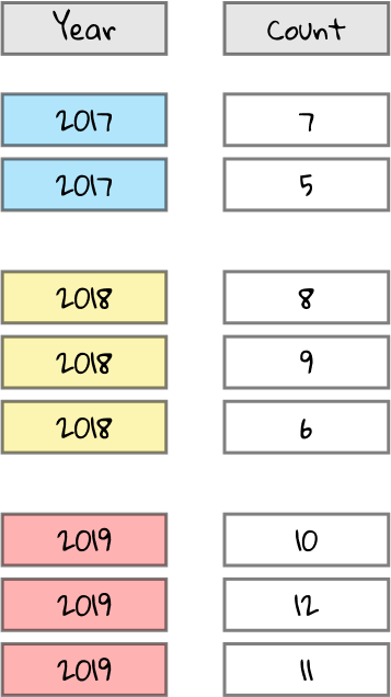
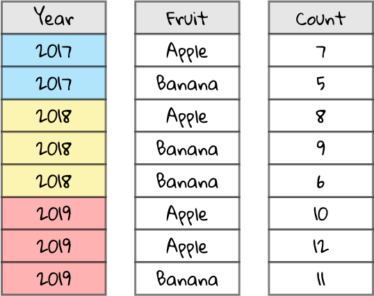
Let’s say we’re a hard-hitting investigative reporter looking into the rise of the fruit industry. We finally get a source at a big agricultural firm to crack and give us their dataset on the number of fruits produced in a given year by different farms. We open up the CSV file, revealing a spreadsheet with three columns: Year, Fruit, and Count.
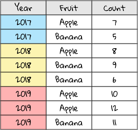
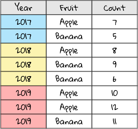
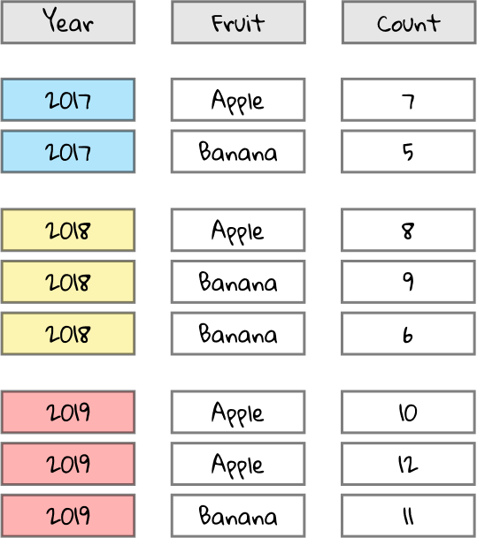
Take a look at this spreadsheet. The Year column describes the year of production (color-coded for illustrative effect), the Fruit column describes the type of fruit, and the Count column details the quantity of that fruit produced by a particular farm. There’s some rows with the same year and fruit, e.g. in 2019 there are two rows with the fruit Apple — that’s because those rows detail two different farms’ apple productions.
It would be great to summarize the data, so we can understand the total fruit production and break it down by year and fruit type. Now, for the sake of this example, this spreadsheet is only a few rows, so you could do it by hand. But imagine that the spreadsheet has thousands of rows. Whatever will we do?
Enter: pivot tables.
Pivot tables: a Swiss army knife for data
Depending on the spreadsheet application you use, there’s almost certainly a way to create a pivot table. In Google Sheets, you go through the menu and hit
Data >
Pivot Table. If an option is presented to place the pivot table in a new sheet or the current sheet, choose
New sheet. Once you create the pivot table, you’ll be presented with a mysterious looking blank table, and on the side will be some kind of
pivot table editor.
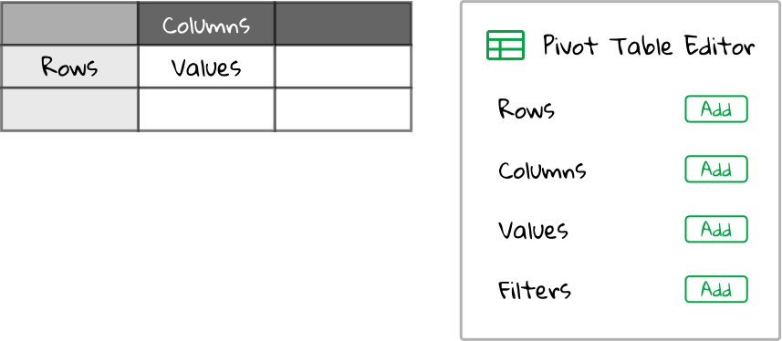
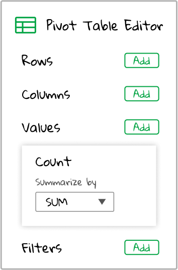
Rows, Columns, Values, Filters — what? To briefly break it down, clicking the green “Add” button on Rows, Columns, and Values allows us to put fields into the pivot table to the left. Fields refers to the name of each column of data in our original spreadsheet. In our case, the dataset we’ve acquired has three fields: Year, Fruit, and Count.
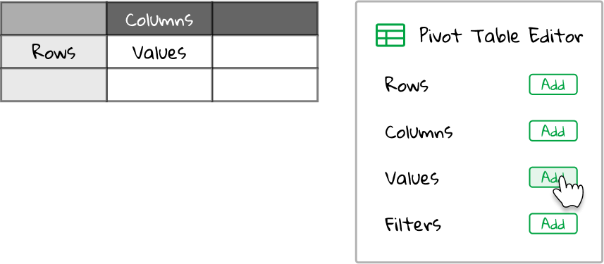
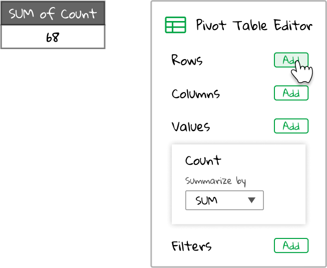
Let’s begin by adding our Count field to Values in the pivot table editor. To do that, click on the green “Add” button next to Values in the pivot table editor.
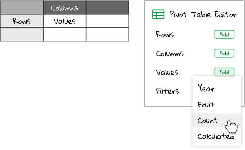
Now we should see a list of all the fields in our spreadsheet pop up. There’s also an option for a calculated field. Don’t worry about that one for now, but the gist is you can create new calculated fields using spreadsheet formulas if you like.
Let’s click on Count.
Now, the Values section of the pivot table editor on the right should expand with a new box. In the box is written the field we’ve selected, Count, along with an aggregation type of Sum. Aggregation type is a fancy way of saying: let’s collect all the values in the spreadsheet and then do something with them. Sum is the default aggregation type, and it means: take all the values for the field we’ve chosen in the spreadsheet and add them together.
So summarizing the Count field with an aggregation type of Sum is telling the pivot table to add all the values in the Count column of the original spreadsheet together.
Let’s take a look at how this would work. Here’s our original spreadsheet:
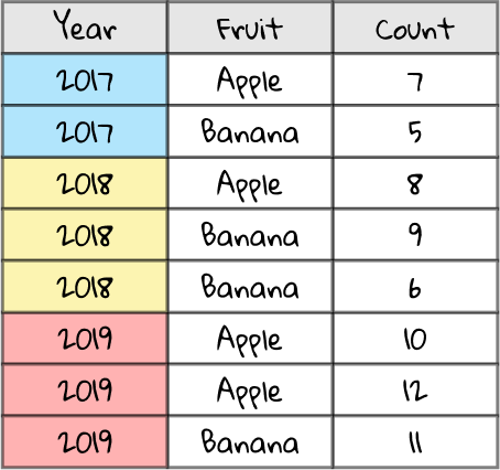
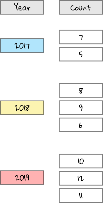
All we care about for now is the Count column, since we’ve selected the Count field above.
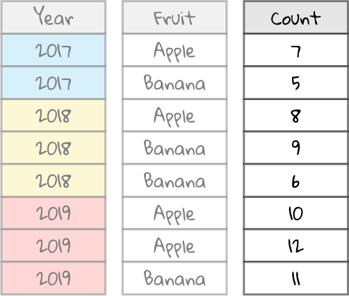
Now, we’re going to take the values in the Count column (7, 5, 8, 9, etc.) and aggregate them together with Sum. If it helps, picture an aggregator as a blender. It takes in a collection of data and spits out a single value as an answer.

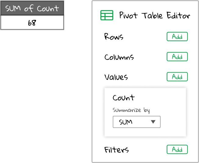
The Sum aggregator in our case is a blender that takes all the values in the Count column and comes back with their total.

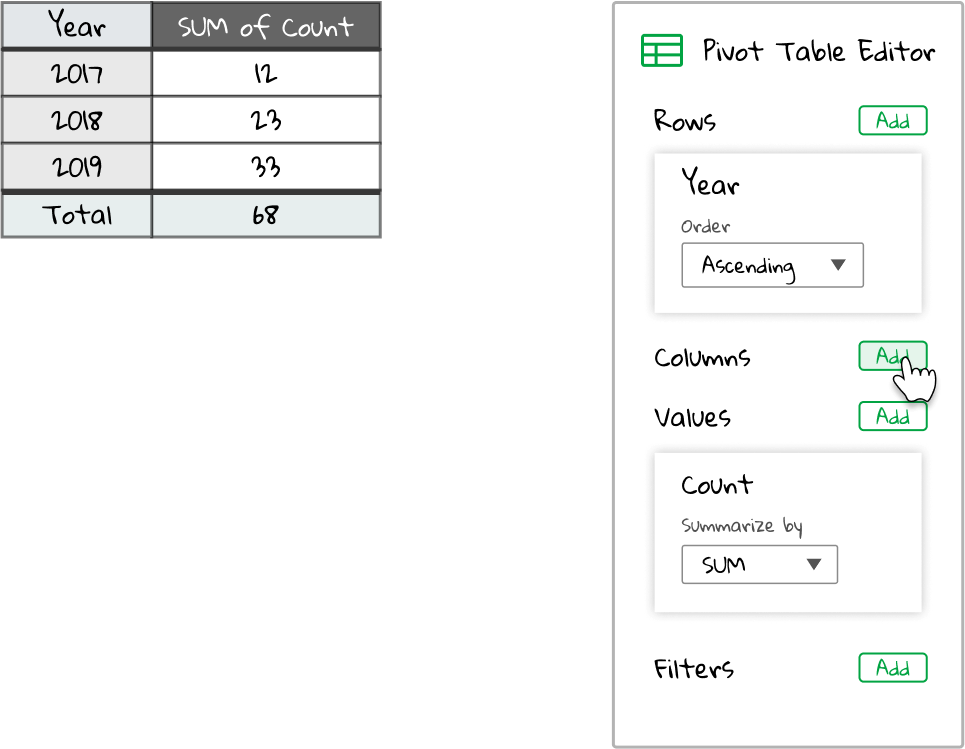
Delicious! Now, the pivot table has aggregated our Sum column and given us a single number back that describes the total of all the values in our dataset. We’ve uncovered the total number of fruits produced in all years! The pivot table now looks like this:
Making things interesting
What do you mean, interesting? Was that not already interesting?
Ok, fine. Summing up all the values in a single column is not the most interesting thing you can do in the world. It certainly is useful, but we could accomplish the same task with a spreadsheet formula. What makes pivot tables interesting is the ability to aggregate data in groupings.
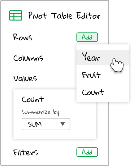
The best way to show this is to do it. Let’s add a field to the Rows section of the pivot table editor.
We’re given the three fields in our spreadsheet: Year, Fruit, and Count. Well, we have already have the total of the Count field. It would be interesting to break this total down by the Year. To accomplish this, select the Year field from the dropdown list.
Now, we are asking the pivot table to list the sum of the Count field for each possible Year value. So, we have our original spreadsheet.
We are only interested in the Year column (because it was selected as a row in the pivot table editor) and Count (because it is still selected as a value in the pivot table editor). So for now, we don’t care about Fruit.
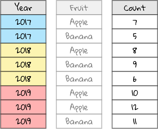
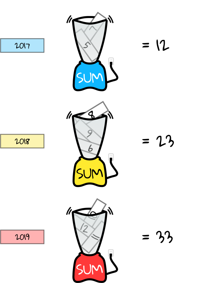
Now, let’s group the resulting spreadsheet by the Year column. We should have two Counts for 2017, three Counts for 2018, and three Counts for 2019.
In the pivot table editor, we had added Year to the Rows section. The resulting pivot table should have a single row for each possible Year, so let’s squash Year down to only show each year once.
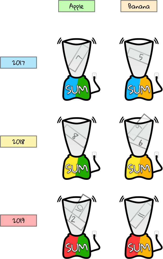
We still have Count in the Values section of our pivot table editor, aggregated by Sum. This means that we want to sum all the Counts for each Year. Let’s represent this with a blue blender for Counts in the year 2017, a yellow blender for Counts in the year 2018, and a red blender for Counts in the year 2019.
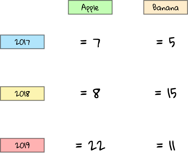
Each blender receives all the Count values for the corresponding year. For instance, in 2017, there were two Count values: 7 and 5. Aggregating these by sum means we calculate 7 + 5 = 12.
The output of each aggregator, or blender, forms the resulting pivot table:
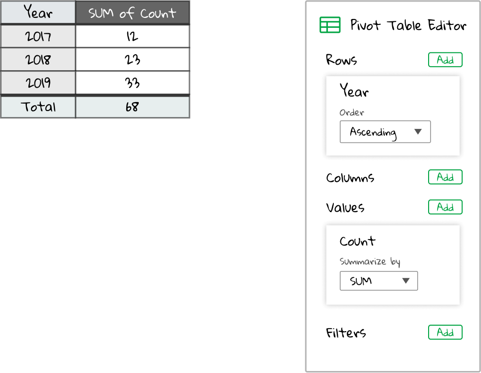
So to summarize, the Values section of the pivot table editor is the most important. That tells us what field to look at and how to aggregate it. The Rows section of the pivot table editor lets us break down the Values. We added Year in the Rows section, so the resulting pivot table will have one row for each possible year (2017, 2018, and 2019). Within each row break down, we run the Values aggregator, in our case summing the Count column.
Taking it to the next level
A pivot table with a field in the Values section is useful to get aggregates across the whole table. Adding a field in the Rows section lets us group the data. This means that the aggregation will run for each possible value for the row field (in our case, Year, which has 3 values: 2017, 2018, 2019).
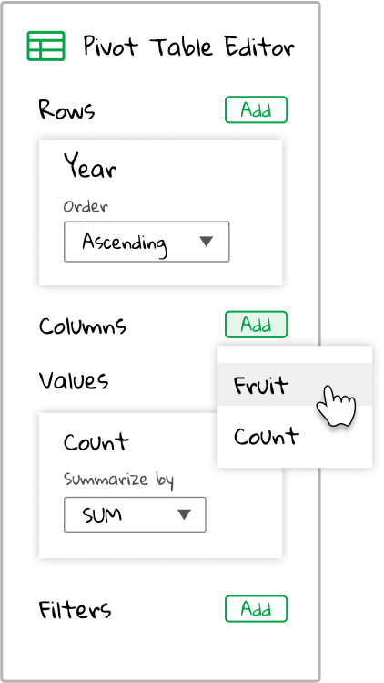
But what if we take it to the next level? We have a breakdown by Year, but maybe we want to break it down by Fruit as well. Let’s try adding a field to the Columns section of the pivot table editor. Click the green “Add” button next to Columns in the pivot table editor.
There’s only two fields to choose from. That’s because we already chose Year above, so it’s not a valid grouping option. Let’s choose Fruit since we’re already aggregating on Count.
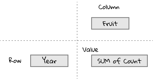
Ok, let’s predict how this will look. After adding the Year to the row field, we had a pivot table with Year in the row headers and the sum of Count as the values. So, adding Fruit as a column field should result in a pivot table with Year in the row headers, Fruit in the column headers, and the sum of Count as the values. Kind of like this:
Let’s see how it turns out. Here’s our spreadsheet again for reference.
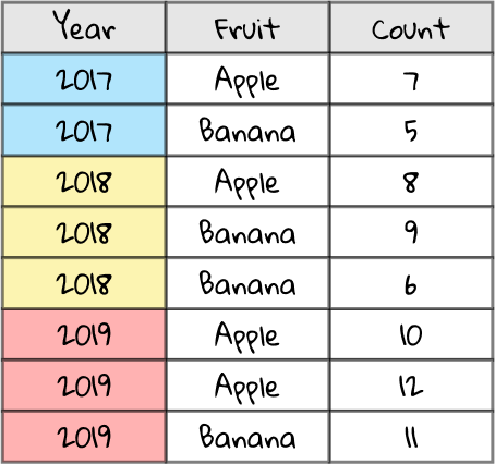
This time we’re going to use every column, so we don’t need to fade anything out.
We can group the Years as before.
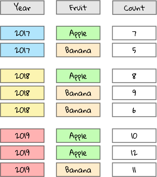
But we’re also going to have to group the Fruits. To make it visually easier to understand, let’s color in the Fruit values. We only have two possible values, Apple and Banana, so let’s color those green and orange, respectively.
Just as before, let’s squash down the fields to only show each Year once. We’ll also move the Fruits to column headers and show each one once. The Counts are shown as values. For instance, 9 and 6 appear right of 2018 and below Banana because those are all the Counts that appear when Year is 2018 and Fruit is Banana.
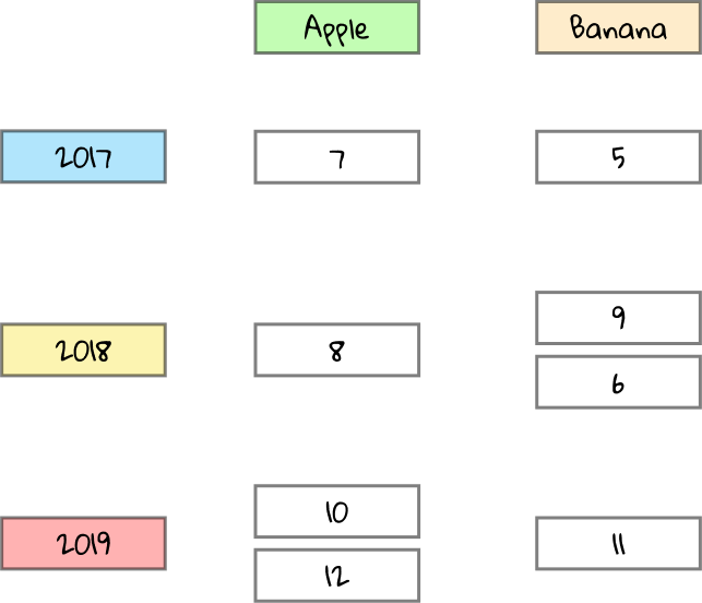
But we have multiple counts in some of the cells. We need to run our aggregator over the values to get the sum. We will use a sum aggregator, or blender, for each possible combination of Fruit and Year. So the 9 and 6 above should get reduced to 9 + 6 = 15. If there’s only one value for a given combo of Fruit and Year, the sum is that value itself.
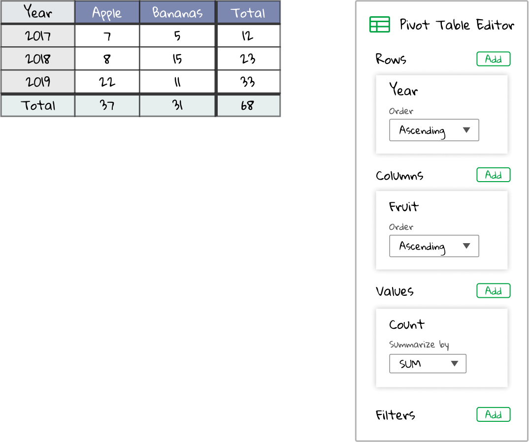
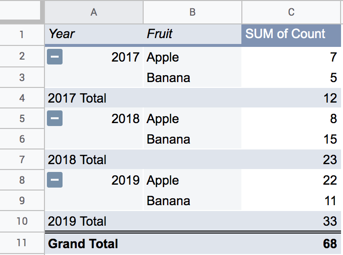
And just like that, we should get a nice summary table of the sum of Count for each combo of Year (in the row header) and Fruit (in the column header). Just as we had predicted above.
The pivot table should look something like this:
Of course, we don’t actually have to manually do any of that work ourselves. The pivot table automates the whole process for us from the second we click on Fruit to add it to the Column section of the pivot table editor. All those blenders are sent churning, grouped by each possible combo of our Row and Column fields. But it’s good to understand exactly how it works to best be able to utilize it.
Going deeper
Hopefully this visual guide serves as a useful explanation for how pivot tables work. Obviously, this example spreadsheet is small, but imagine if we had thousands of rows spanning decades of fruit production. What if there were an additional column for the farm that produced the fruits, and maybe a column for the state each farm is in. You could pivot on those additional fields and potentially discover shocking insights, like declining apple production in Washington over the years. Those insights might inform news stories.
We showcased the most simple use cases of pivot tables, but you can do even more things. We aggregated by sum, but you can change the aggregation type in the Values panel in the pivot table editor. You could, for instance, aggregate by the average.
You can have multiple fields in the Rows section. You can click and drag the Fruit field from the Columns section of the pivot table editor to the Rows section to test it out. This causes there to be multiple row headers, one for Year and one for Fruits. In Google Sheets, it would look something like this:
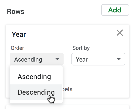
When fields are grouped together, they have to be shown in a particular order. For instance, the Years field is shown going from 2017 to 2019 in ascending order in the row headers. You can change the way it’s sorted. Making it sort in descending order, for instance, would show the Year going from 2019 to 2017 in the row headers.
In Google Sheets, you can change the sort order by clicking on the box called Order within a row or column field in the pivot table editor. Changing the sort order of the Year field to descending would look like this:
You can also add Filters in the pivot table editor. This flexible feature allows you to exclude certain fields from groupings. For example, you might be uninterested in bananas and could thus exclude Banana from appearing as part of the Fruit field.
The best way to gain an intuitive understanding of the pivot table is to play around with it using actual data. There are lots of ways things can go wrong, as well. For instance, plugging in the Count field as a Row and as a Value in the pivot table editor will result in a strange looking pivot table where each possible Count value is summarized in row headers. That’s probably not something you’d want.
In general, the best practice is to start with what you want in the Value field and then work backwards to what groupings would be useful in row and column headers. You can then try more advanced features like filters or change sort orders and aggregation types. Hopefully this guide provides a good base intuition for you to successfully explore your data.